
브이로그
2024년 4월 12일 CSS-Priority 본문
오늘은 CSS코드에서 우선순위계산에 대해서 알아볼꺼야
코드를 작성해도 속성에 따라 먼저 적용되는게 있어 파이썬을 비교해보면 +=와 같은 의미인거지 연산의 순서가 있듯이
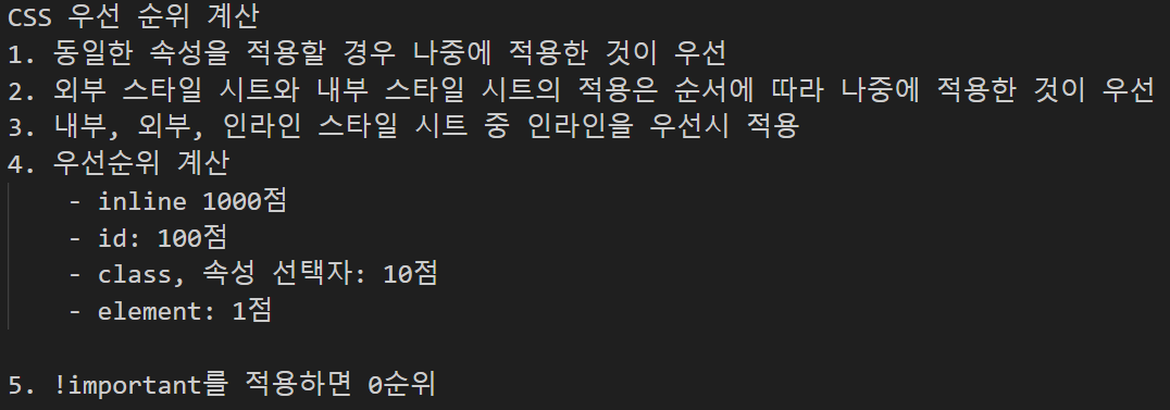


1. CSS 우선순위
<!DOCTYPE html>
<html lang="en">
<head>
    <meta charset="UTF-8">
    <meta name="viewport" content="width=device-width, initial-scale=1.0">
    <title>CSS 우선순위</title>
    <style>
        #id-style { background-color: deeppink; }
        #id-style2 { background-color: deepskyblue; }
        div {
            display: block;
            padding: 30px;
            margin: 30px;
            background-color: gold;
        }
        .class-style3 {
            background-color: beige !important;
        }
        .class-style {
            background-color: greenyellow;
        }
        .class-style2 {
            background-color: pink;
            font-size: 25px;
        }
        ul > li.li-class {
            background-color: orange;
        }
        ul > li {
            background-color: violet;
        }
    </style>
    <link rel="stylesheet" href="./css/style.css">
</head>
<body>
    <h2>CSS 우선순위</h2>
    <div style="background-color: aqua;">div 1번(인라인aqua)</div>
    <div id="id-style" class="class-style">div 2번(id deeppink)</div>
    <div class="class-style">div 3번(class greenyellow)</div>
    <div class="class-style2 class-style">div 4번(class pink >> if 같은 속성 나중 적용이 우선)</div>
    <div>div 5번(purple)</div>
    <ul>
        <li class="li-class">li 1번(class orange >> 점수가 높음)</li>
    </ul>
    <div id="id-style2" class="class-style3">div 6번(important beige)</div>
</body>
</html>

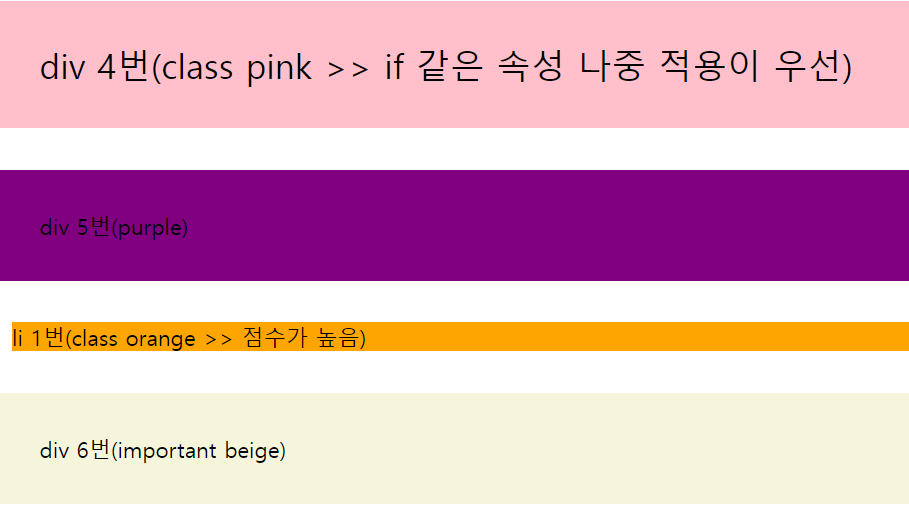
가장 순위가 높은 속성부터 적용되는거니까 잘 생각하면서 해보자
2. CSS 변수
<!DOCTYPE html>
<html lang="en">
<head>
    <meta charset="UTF-8">
    <meta name="viewport" content="width=device-width, initial-scale=1.0">
    <title>css 변수</title>
    <style>
        :root {
            --background-color: deepskyblue;
            --text-color: white;
        }
        .first-list {
            background-color: var(--background-color);
            color: var(--text-color);
        }
        .second-list {
            background-color: var(--background-color);
            color: var(--text-color)
        }
        @media screen and (max-width: 768px) {
            :root{
                --background-color: darkslateblue;
                --text-color: ivory
            }
        }
    </style>
</head>
<body>
    <h2>css 변수</h2>
    <ul class="first-list">
        <li>김사과</li>
        <li>반하나</li>
    </ul>
    <ul class="second-list">
        <li>오렌지</li>
        <li>베애리</li>
        <li>이메론</li>
    </ul>
</body>
</html>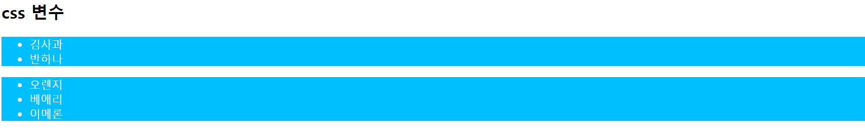
이건 저번에 했던 크기에 따라 속성을 다르게 줘서 표현해보는거거든
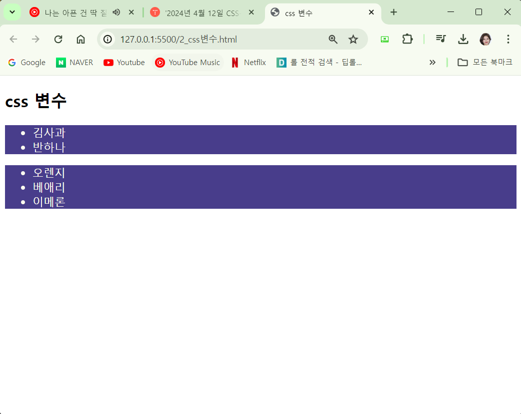
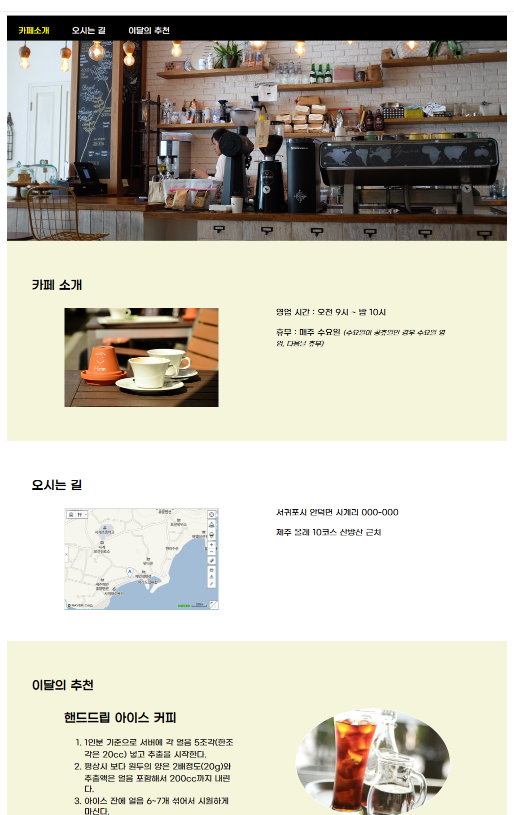
3. 카페
<!DOCTYPE html>
<html lang="en">
<head>
    <meta charset="UTF-8">
    <meta name="viewport" content="width=device-width, initial-scale=1.0">
    <title>카페소개</title>
    <link rel="stylesheet" href="./css/cafe.css">
</head>
<body>
    <div id="container">
        <header>
            <nav>
                <ul>
                    <li><a href="#intro">카페소개</a></li>
                    <li><a href="#map">오시는 길</a></li>
                    <li><a href="#choice">이달의 추천</a></li>
                </ul>
            </nav>
        </header>
        <section id="intro">
            <div class="page-title">
                <h2>카페소개</h2>
            </div>
            <div class="content">
                <div class="photo"><img src="./img/coffee.jpg" alt="커피"></div>
                <div class="text">
                    <p>영업시간 : 오전 9시 ~ 밤 10</p>
                    <p>휴무 : 매주 수요일<i><small>(수요일이 공휴일인 경우 수요일 영업, 다음날 휴무)</small></i></p>
                </div>
            </div>
        </section>
        <section id="map">
            <div class="page-title">
                <h2>오시는길</h2>
            </div>
            <div class="content">
                <div class="photo"><img src="./img/map.jpg" alt="지도"></div>
                <div class="text">
                    <p>서귀포시 안더면 사계리000-000</p>
                    <p>제주 올레 10코스 산방산 근처</p>
                </div>
            </div>
        </section>
        <section id="choice">
            <div class="page-title">
                <h2>이달의 추천</h2>
            </div>
            <div class="content">
                <div class="photo"><img src="./img/ice.jpg" alt="추천"></div>
                <div class="text">
                    <h2>핸드드립 아이스 커피</h2>
                    <ol>
                        <li>1인분 기준으로 서버에 각 얼음 5조각(한 조각은 20cc) 넣고 추출을시작한다.</li>
                        <li>평상시 보다 원두의 양은 2배정도(20g)와 추출액은 얼음 포함해서 200cc까지 내린다.</li>
                        <li>아이스 잔에 얼음 6~7개 섞어서 시원하게 마신다.</li>
                    </ol>
                </div>
            </div>
        </section>
        <footer>
            <p>My times with Coffee</p>
        </footer>
    </div>
</body>
</html>
CSS코드


@font-face {
    font-family: 'WAGURITTF';
    src: url('https://cdn.jsdelivr.net/gh/projectnoonnu/2403@1.0/WAGURITTF.woff2') format('woff2');
    font-weight: normal;
    font-style: normal;
}

body { font-family: 'WAGURITTF';}

#container {
    width: 100%;
    margin: 0 auto;
}

nav {
    height: 50px;
    background-color: black;
}

nav > ul {
    list-style: none;
    margin: 0;
    padding: 3px;
}

nav > ul > li {
    display: inline-block;
    margin: 15px 20px;
}

a { text-decoration: none;}
a:link, a:visited {color: white;}
a:active, a:hover {color: yellow;}

header {
    width: 100%;
    height: 300px;
    background-image: url(../img/header.jpg);
    background-repeat: no-repeat;
    background-position: center;
    background-size: cover;
    margin: 0;
}

.photo {display: none;}

section {
    position: relative;
    width: 100%;
    padding: 15px 5%;
}

.page-title {
    position: absolute;
    top: 20px;
    left: 0px;
    padding: 30px 50px;
}

.content {
    margin: 80px auto 10px;
    width: 90%;
    padding: 20px;
    box-sizing: border-box;
}

#container section:nth-child(even) {
    background-color: beige;
}

footer {
    position: relative;
    width: 100%;
    height: 100px;
    background-color: black;
}

footer > p {
    color: white;
    text-align: center;
    line-height: 100px;
}

/* 태블릿 */
@media screen and (min-width: 768px) {
    header {height: 400px;}
    #intro, #map {
        box-sizing:  border-box;
        width: 50%;
        float: left;
        margin: 0;
        height: 300px;
    }

    #choice {
        clear: both;
    }
}

/* PC */
@media screen and (min-width: 1024px) {
    #container {
        width: 1000px;
        margin: 0 auto;

    }

    header {height: 450px;}

    #intro, #map, #choice {
        box-sizing: border-box;
        position: relative;
        width: 100%;
        height: 400px;
        padding: 15px 5%;
    }

    .photo {
        display: block;
        width: 40%;
        margin-top: 20px;
    }

    .content {
        margin: 80px auto 10px;
        width: 90%;
        padding: 20px;
    }

    .photo > img {
        width: 100%;
        max-width: 320px;
        height: auto;
        margin-bottom: 30px;
    }

    #intro .photo, #map .photo {
        float: left;
        margin-right: 5%;
    }

    #choice .photo {
        float: right;
    }

    .text {width: 45%;}

     #intro .text, #map .text {float: right;}

     #choice .text {float: left;}

     #choice .photo img {border: 1px solid white; border-radius: 50%;}

     footer {clear: both;}


}
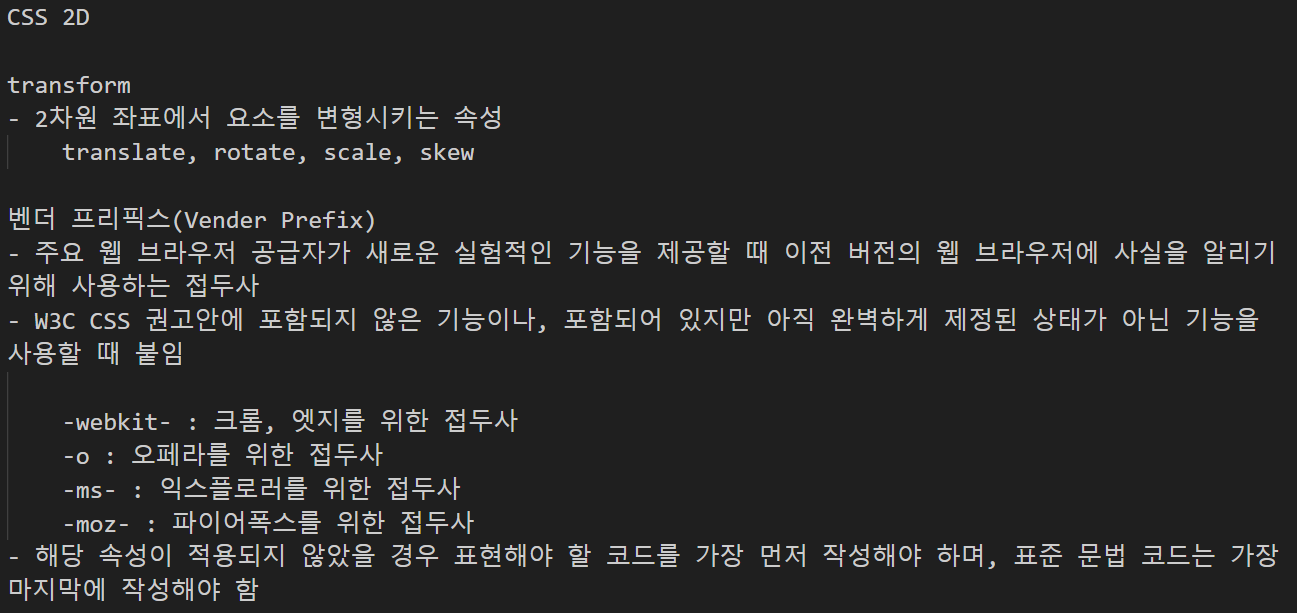
4. transform
<!DOCTYPE html>
<html lang="en">
<head>
    <meta charset="UTF-8">
    <meta name="viewport" content="width=device-width, initial-scale=1.0">
    <title>transform</title>
    <style>
        p {
            width:  600px;
            padding: 20px;
            border: 3px solid rgba(0, 0, 0, 0.5);
        }
        #translate {
            transform: translate(30px, 50px);
            background-color: deeppink;
        }
        #rotate {
            transform: rotate(60deg);
            background-color: gold;
        }
        #scale {
            transform: scale(1.5, 1.2);
            background-color: orange;
        }
        #skew {
            transform: skew(30deg, 15deg); /* x축의 기울기 각도, y축의 기울기 각도 */
            background-color: yellowgreen;
        }
        #gradient {
            background-color: pink;
            /* 크롬, 엣지를 위한 코드 */
            background: -webkit-linear-gradient(left, pink, gray);
            /* 오페라를 위한 코드 */
            background: -o-linear-gradient(left, pink, gray);
            /* 익스플로러를 위한 코드 */
            background: -ms-linear-gradient(left, pink, gray);
            /* 파이어폭스를 위한 코드 */
            background: -moz-linear-gradient(left, pink, gray);
            /* CSS 표준 문법 코드 */
            background: linear-gradient(left, pink, gray);
        }
    </style>
</head>
<body>
    <h2>transform</h2>
    <p>original</p>
    <p id="translate">translate</p>
    <p id="rotate">rotate</p>
    <p id="scale">scale</p>
    <p id="skew">skew</p>
    <p id="gradient">gradient</p>
</body>
</html>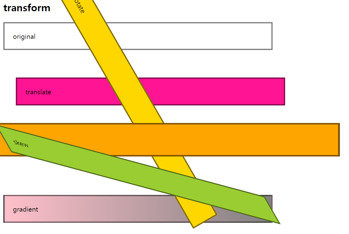
<!DOCTYPE html>
<html lang="en">
<head>
    <meta charset="UTF-8">
    <meta name="viewport" content="width=device-width, initial-scale=1.0">
    <title>transition1</title>
    <style>
        div {
            width: 100px;
            height: 100px;
            float: left;
            margin: 30px;
        }
        #bg-tr {
            background-color: gold;
            transition: background-color ease 2s;
        }

        #bg-tr:hover {
            background-color: red;
        }

        #border-tr {
            background-color: deeppink;
            border: 3px solid black;
            transition: all linear 2s;
        }

        #border-tr:hover {
            background-color: pink;
            border: 3px dotted gray;
            border-radius: 50%;
        }
    </style>
</head>
<body>
    <h2>transition1</h2>
    <div id="bg-tr"></div>
    <div id="border-tr"></div>
</body>
</html>
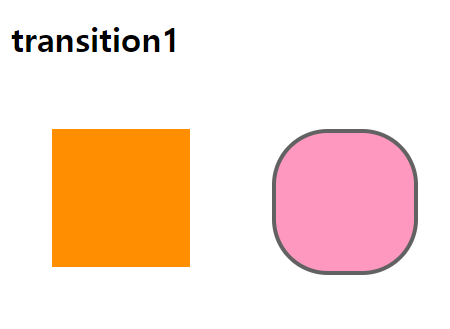
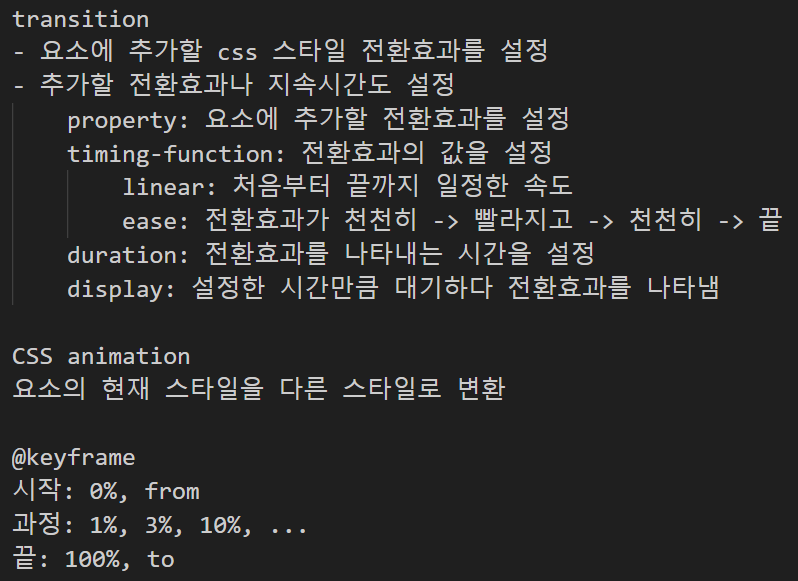
박스에 호버(마우스를 올려놓기)를 해주었을 때의 변화를 준거야 마우스를 올려놓았을 때 2초후 색 변환
오른쪽은 모양까지 바꿔줬어
<!DOCTYPE html>
<html lang="en">
<head>
    <meta charset="UTF-8">
    <meta name="viewport" content="width=device-width, initial-scale=1.0">
    <title>transiotion2</title>
    <style>
        h2 {text-align: center;}
        #ex {
            position: relative;
            width: 800px;
            height: 400px;
            margin: 0 auto;
            border: 5px solid black;
            padding: 30px;
        }

        p {
            text-align: center;
            padding-top: 50px;
            font-weight: bold;
        }

        .box {
            font-size: 20px;
            position: relative;
            width: 140px;
            height: 140px;
            margin-bottom: 50px;
            background-color: yellow;
        }

        #ex:hover > .box {
             transform: rotate(720deg);
             margin-left: 650px;
             background-color: aqua;
        }

        #no-delay {
            transition-duration: 3s;
        }

        #delay {
            transition-delay: 1s;
            transition-duration: 2s;
        }
    </style>
</head>
<body>
    <h2>transition2</h2>
    <div id="ex">
        <div id="no-delay" class="box">
            <p>(❁´◡`❁)</p>
        </div>
        <div id="delay" class="box">
            <p>(*/ω\*)</p>
        </div>
    </div>
</body>
</html>

박스에다가 호버를 했을 때 2바퀴씩 돌면서 끝으로 가는거야 나는 여기에 그냥 가는게 아니라 색깔을 넣어줬어
5. animation
<!DOCTYPE html>
<html lang="en">
<head>
    <meta charset="UTF-8">
    <meta name="viewport" content="width=device-width, initial-scale=1.0">
    <title>animation</title>
    <style>
        .box {
            margin-top: 100px;
            margin-left: 100px;
            padding: 20px;
            height:  60px;
            animation-name: moving;
            animation-duration: 3s;
            animation-iteration-count: infinite;
            animation-direction: alternate;
        }

        @keyframes moving {
            from {
                width: 200px;
                background-color: gold;
                opacity:  0.5;
                transform: rotate(0deg);
            }

            to {
                width: 400px;
                background-color: pink;
                opacity: 1;
                transform: rotate(360deg);
            }
        }
    </style>
</head>
<body>
    <h2>animation</h2>
    <div class="box">
        <h3>CSS3 animation</h3>
    </div>
</body>
</html>
요 상태로 게속 돌았다가 다시 되돌아오고 하는거야
'CSS(Cascading Style Sheets)' 카테고리의 다른 글
| 2024년 4월 14일 CSS-Login&Regist&Resume Task (0) | 2024.04.14 |
|---|---|
| 2024년 4월 12일 CSS-Login&Task2 (0) | 2024.04.12 |
| 2024년 4월 11일 CSS-Layout (0) | 2024.04.12 |
| 2024 년 4월 9일 CSS-Login&Regist Task (0) | 2024.04.09 |
| 2024년 4월 9일 CSS-Background (0) | 2024.04.09 |
'CSS(Cascading Style Sheets)' Related Articles
more


